It's not just how you present numbers to the business visually, but what information you need to show in order for the executives to understand IT initiatives and value.
I previously discussed the use of visualization to get your message across when addressing the business. As the old adage goes, “a picture paints a thousand words.” In multilingual and multicultural settings, a picture also requires less translation, as long as you’re aware of the pitfalls of negative cultural associations with certain imagery (besides the obvious such as religious imagery).
Here’s a look at what information you want to be using with your business partners to help them understand IT initiatives, investment and value for money.
Just the facts
Let’s face it: the vast majority of us in the IT industry have engineering and science backgrounds. We’ve been brought up to honor and cherish factual data and believe that others should do as well (probably the CFO at any rate).
It’s normal, therefore, that we look to quantitative and measurable key point indicators (KPIs) and performance metrics as our source of data for IT. It’s not easy though, to explain the meaning and importance of many of our metrics to the business. Packet loss and throughput may keep the network manager awake at night, but talking about them to people from sales and marketing is more likely to put some people to sleep.
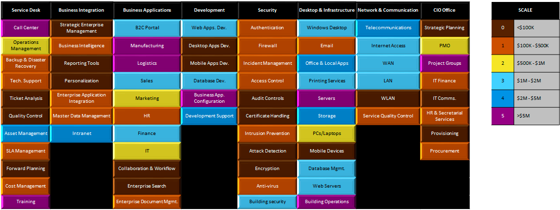
An alternative could be budget.
The color scale, here, uses colors based on the suggestions in my previous article. They have lower cultural and psychological connotations that colors frequently used, and can be differentiated by people suffering from color-blindness, such as protanopia and deuteranopia.
The problem is, though, that while this chart may mean something to you, the CIO, and to the CFO, is it really going to mean anything to the rest of the executive committee? The answer is probably no, and moreover, showing this type of data could well lead to arguments over subjects you don’t want to touch, such as is it fair that the marketing systems spend is much lower than on finance systems? And what about HR systems?
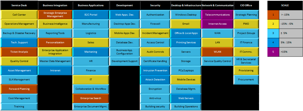
It’s much better to save financial data for only financial meetings. Even then, raw information, such as the above, still often has more power to create conflict than to help justify your case. You might want to consider, instead, focusing on the goals of the financial meeting. If you are in a budget restriction process, for instance, you could try fixing on target percentage cuts, as in the following:
 Afzal Ballim
I’ll show you mine
There is a financial metric that I particularly like, and that can often be used outside of finance meetings. This is spend relative to industry averages. It has the advantage of comparing your running costs relative to a baseline. Of course, you need to decide what message you want to give about your organization compared to the others. The hardest thing, of course, is finding the baseline. While big consulting companies and research companies such as Gartner can often offer access to such data, the question always remains on how appropriate the baseline industries are as a comparison to your own organization.
My experience has been that while many organizations have a tendency to believe that they are “unique,” the increased access to baseline data in recent years has created an acceptance of using it. A nice thing about such data is that you can see where you are over-investing or investing for competitive edge, and where you are under-investing, quite easily.
 Afzal Ballim
Beyond the budget
While financial data is often the most accessible data on IT, spend alone doesn’t explain or justify the work of the IT department. Even though most mature organizations will use some form of return on investment (ROI) calculations for investments, possibly based on net present value (NPV) or internal rate of return (IRR), it is notoriously hard to justify a large part of IT budget lines in this way. The importance of ROI in transformation initiatives and investment in major applications is pretty clear cut. As we know, however, it becomes much harder to try applying it to “keeping the business going” type projects, and infrastructure. IT managers may have had crash courses on financial tools, which is always a good thing to have done, but that doesn’t make it any easier to find the quantifiable financial benefits of, say, putting in a new storage-area network (SAN).
I began this article by saying that the types of metrics we use in IT have little meaning to people outside of our area. In individual cases it may be worthwhile trying to educate our business colleagues on some of them, but it’s far too easy to leave them wallowing in techno-babble, shaking their heads and looking at their watches.
This doesn’t mean that we can’t use those metrics, however, in supporting our case for investments. The best way, is to have a baseline to work from. Preferably, this baseline will come from an independent source, and across comparable organizations to our own. The more that you use standard metrics in your measuring of individual areas, the more likely you will be to find such baselines.
It’s impossible in the scope of this article to discuss such metrics in detail, although I hope to return to the subject in the future. Let’s presume, however, that you are measuring with such standard metrics, and have baseline data.
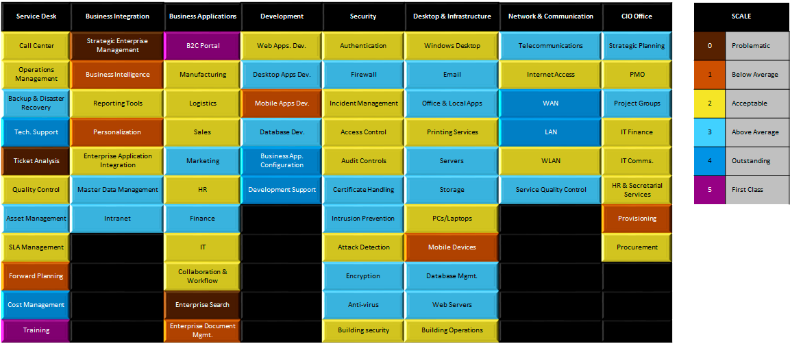
Again, using the visualization methods I’ve discussed above, you can give a simple state of affairs to your colleagues that expresses performance against those metrics, as in the following picture:
 Afzal Ballim
Using a picture like this, you can easily show that your training team is outstanding, and that your support of the company B2C portal is also best in class. You can draw attention to problematic areas such as ticket analysis in the service desk, or the state of enterprise search. You can also draw attention to the issues with IT provisioning, maybe problems of high staff turnover in the overseas help desk.
Of course, other tools like balanced scorecards are also your friend in your board discussions, but what I’ve tried to cover here are some simple ways to make it easier to talk to the state of the IT department. In my next article I’m going to dive deeper into other ways of analyzing the IT department for presentation to your colleagues.
Please note that if you’d like a copy of the Excel file that I use for my diagrams, you can email me.