CIO.com blogger James A. Martin was curious to see how some apps he frequently uses on his iPad 2 look on the new iPad’s Retina display. The verdict: Text is crisper and colors brighter, but overall, the differences aren’t huge.
The “Wow!” factor of the new iPad’s Retina high-definition display isn’t going to hit you when, say, reading an article in The New York Times iPad app. Still, I was curious to see if there was a noticeable difference in how some of the applications I use most frequently look on the new iPad, compared to how they look on my iPad 2.
In other words, what do you really get for the additional storage space these Retina-optimized apps consume? (For more on how apps for the new iPad consume more storage than their earlier versions, even if you only use an iPhone, see last Friday’s blog post, “How the New iPad Will Shrink Your iPhone Storage—and What You Can Do About It.”)
The iPad apps I compared—Tweetbot, Kindle, The New York Times, and Pandora—have all been updated to take advantage of the new iPad’s Retina display. Here’s what I noticed:
Tweetbot for iPad by Tapbots ($3; current version 2.1).
Text, when enlarged to “Huge” in the app’s settings, does indeed look a bit crisper on the new iPad vs. the iPad 2. Twitter profile pictures were smaller on the new iPad, but also sharper. However, Tweetbot really isn’t that different on the two iPads. (For more on Tweetbot, read my recent review, Tweetbot iPad App Helps Focus Your Tablet Tweeting.)
Kindle by Amazon (free; current version 3.0).
On the new iPad Kindle text looks sharper, more like printed ink on paper than on the iPad 2. In some cases, the new iPad shows slightly more text on the screen, compared to the same book on the same page on the iPad 2. But I noticed no significant difference between images in Kindle books or magazines.
The New York Times (free; current version 2.2).
The NYT text also looks crisper in the new iPad app—but again, it doesn’t hit you between the eyes unless enlarged. See the comparison below; the iPad 2 text on top, the new iPad below. Note how the iPad 2 text is thicker and a little blurry.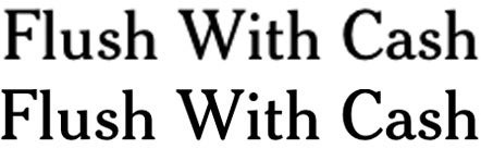
Images look about the same, though primary colors are richer on the new iPad. If you put a magnifying lens to the images, you’d notice the iPad 2 pics look a little pixilated compared to the same photos viewed on the Retina display. Perhaps the most dramatic difference I noticed is the color of the iPad’s Newsstand faux wood bookshelf, where The New York Times app lives. On the iPad 2, the color has a reddish tone; on the new iPad, it’s more golden.
Pandora Radio (free; current version 3.1.22)
The visual differences in this streaming music app are slight—starting to see a pattern here? The font characters in Pandora logos, on the new iPad, look thinner and more elegant, especially when you look closely or zoom in. I can’t say I noticed any big difference in how album artwork looked, however. (Shown below: Pandora on the iPad 2, top; and on the new iPad.)
I’ve haven’t yet compared more visually oriented apps or activities, such as watching an HD movie or using a photo-editing app. However, I did notice a dramatic difference in the quality of photos and video captured on the iPad 2 vs. the new iPad, which isn’t surprising given the new iPad’s superior camera. (Superior to the iPad 2 camera, I should say. It’s inferior to the iPhone 4S’s camera.)


In my experience, everything pops a bit more on the new iPad. That said, the visual improvements in apps you’re likely to use every day are mostly subtle—and they’re certainly not enough to justify upgrading on their own. Then again, to paraphrase Mick Jagger, if you really want a new iPad, you don’t need no justification.
Have you noticed any major improvements in the apps you use regularly on the new iPad?